Sometimes when a painting really does not go the way you want it to, it is easier just to cover the whole thing with gesso and start again.
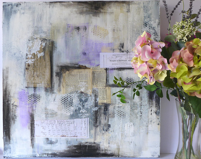
So that's what I did with this painting, with the layers underneath providing some fantastic texture.
I continued to add more collage and stencilling. And by adding some grungy black marks with a Sennelier oil stick, it really began to take on a distressed shabby chic look.
In the next photo you can really see the amazing texture.
I thought the damask stencil really lent
itself to the whole new vintage vibe. Unfortunately it is quite an old
stencil and I'm not sure who made it but there are plenty of similar on Amazon and Ebay.
I will continue to work on this but I have several projects on the go at the moment, I keep getting so eager that I move on to my next idea without finishing my last project!
Anyway, I hope you like the video with the painting as it is at the moment,
I have made the decision to resurrect my blog. Now feels the right time. Let me explain...
After only a few months of starting this blog over a year ago, I was unable to continue with it. As my last post suggests my health was in trouble. Big trouble. Really big trouble. OK, not terminal, but nonetheless still very serious.
So I had to take a break. Despite feeling ill so much of the time, as soon as I felt well enough, I wanted to move into videoing my art work with a view to starting a Youtube channel. It kept me motivated through some very dark times.
Of course, it was the art that was the main motivation, not just the desire to do Youtube. Art has always been my saviour and has kept me going both physically and mentally.
So, my lovely hubbie made an overhead rig for my video camera, and when I felt well enough, I switched on the camera each time I worked. Then I had to learn video editing. Luckily hubbie is a whiz at the tech stuff and was able to teach me the ropes. But it took a long time as I could only learn it in between my health relapses. So my blog suffered, I simply could not do Youtube and blogging.
I had no idea how time consuming being a Youtube creator is, and I take my hat off to each and every one. There was so much to learn that only now do I feel confident with creating videos. I actually really enjoy video editing and find it every bit as creative as the art work. And in turn I now feel able to do Youtube and create blog posts as well. I enjoy writing as well a creating videos, and sometimes it easier to explain my thought processes in a blog rather than a video. Above all though, doing all of this has helped me get through some very tough times and has helped take my mind off feeling so tired and ill so much of the time.
My new fave toys art products are Sennelier oil sticks as I demonstrated in my last Youtube video here. The Sennelier oil sticks blend very easily and can be used to create a very grungy, messy, smudgy background very quickly. Not only that but I discovered that you can layer acrylic paint over the top. It will dry and adhere perfectly.
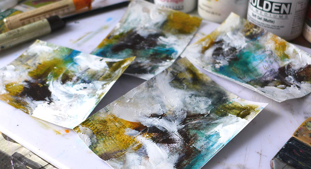
And here is my messy desk with my messy art work...
I love love these colours. The rich yellow ochres combined with sepia and teal is especially one of my favourite colour combinations. In addition to the oil sticks I used Sepia Extra acrylic paint by Old Holland to add even more depth of colour.
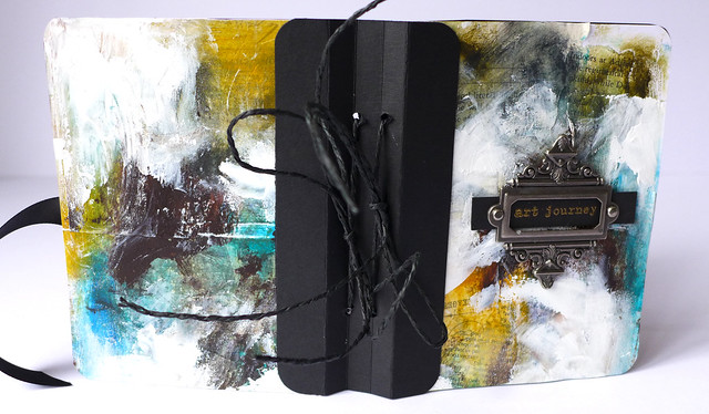
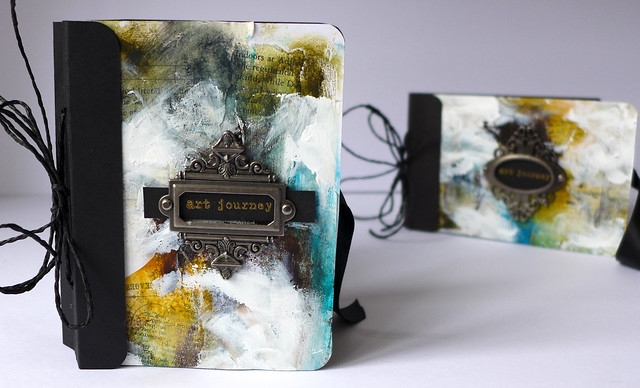
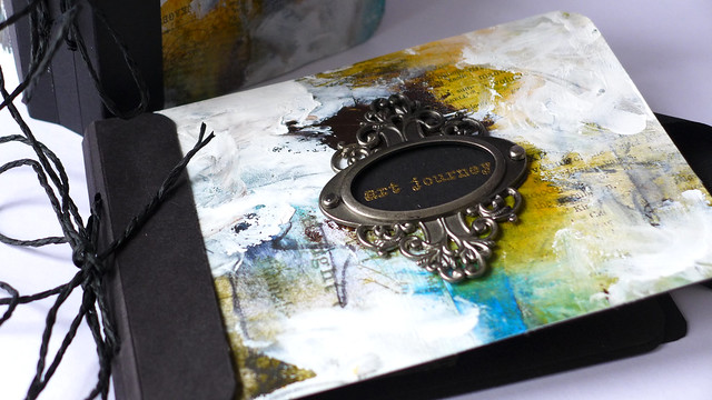
And so I created art journal covers with my art work. You can see how I made them in my Youtube video here.
I love how they turned out...
I didn't go too heavy on the oil sticks and love that I can still see my vintage papers and book text collage peeking through.
I deliberately don't even try and blend my white paint very much, I like the raw almost unfinished look. Maybe that's a bit weird but I just love messy art!
The gold heat embossed sentiments are from my favourite stamp set by Donna Downey called "Empowered Words" by Unity stamps.
I have used May Arts cord to secure my journal signatures.
I did wonder if anyone would watch my Youtube videos as the process of mixed media and abstract art can be soo ugly at times but you have to go through the ugly hot mess to get to the beauty. At least sometimes. It doesn't always work out lol.
I shall be entering my messy art journal covers in to the Simon Says Monday challenge this week which is called "play with paint".
You can see the whole process on my Youtube channel Red Queen Art Creations
Hi! Apologies for the long gap since my last post. I have been concentrating on video editing over the last few weeks in the hope that I will soon have my own Youtube channel, but this has inevitably impacted on my crafting.
But today I just had to get back to creating and as I haven't done any art journalling for while, I thought it would make a nice change for me.
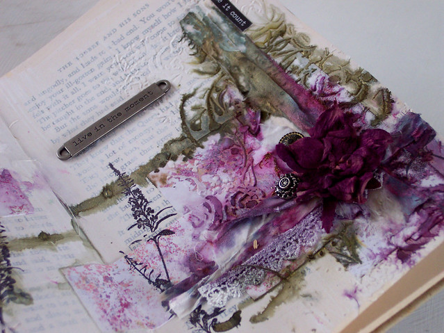
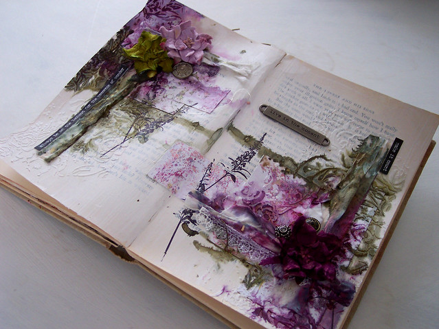
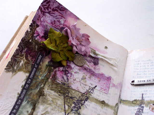
I have created these pages for this week's Simon Says Monday Challenge which is called "A Trio of Something". So I have included 3 flowers, 3 brads and 3 sentiments!
I wanted to add texture to my pages so I have used strips of old ribbon and fabric, and I hope it adds to the overall vintage look.
My "art journal" is in fact a really old book that is actually starting to fall apart, but it is great for journalling as the pages are quite thick and can withstand pretty much whatever I throw at it!
I will continue with my video editing but I know this may well slow down my blogging as a result, but I will try to be back as soon as possible I promise!
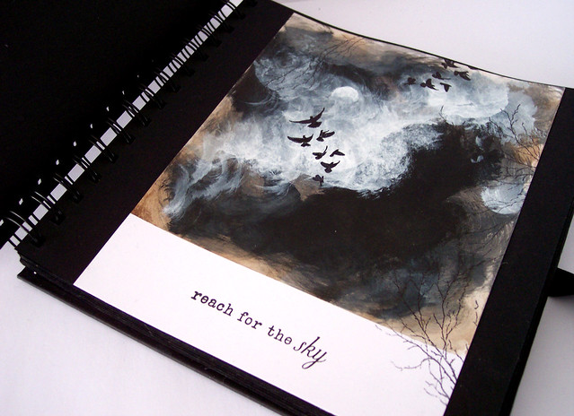
Something a little bit different from me today. A mini painting of a very dark brooding stormy sky which I have created for this week's Simon Says Monday challenge called "Whatever the Weather".
I used cotton wool and acrylic paint to create the cloudy sky. I love using cotton wool with acrylics for painting as you can get lovely soft edges that I find difficult to get with a paint brush.
The little birds are a stamp by That's crafty called Lynne's Affirmations-set 2. And I added an Inkylicious branch stamp around the edges.
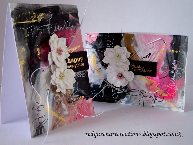
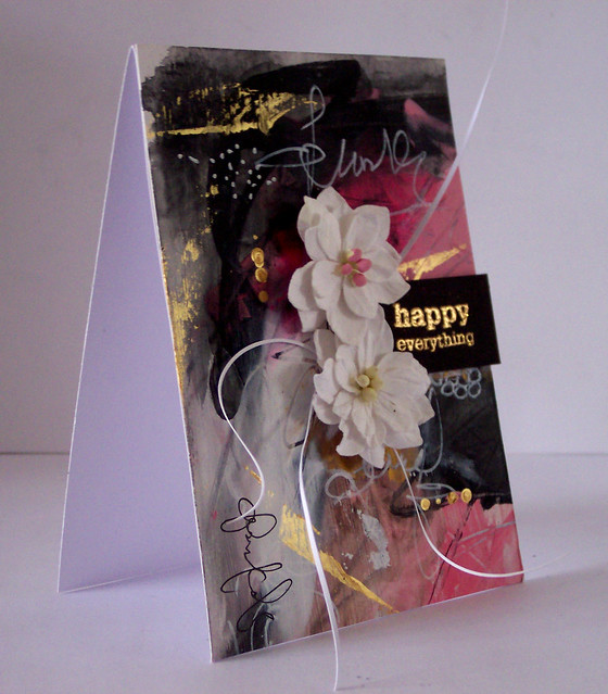
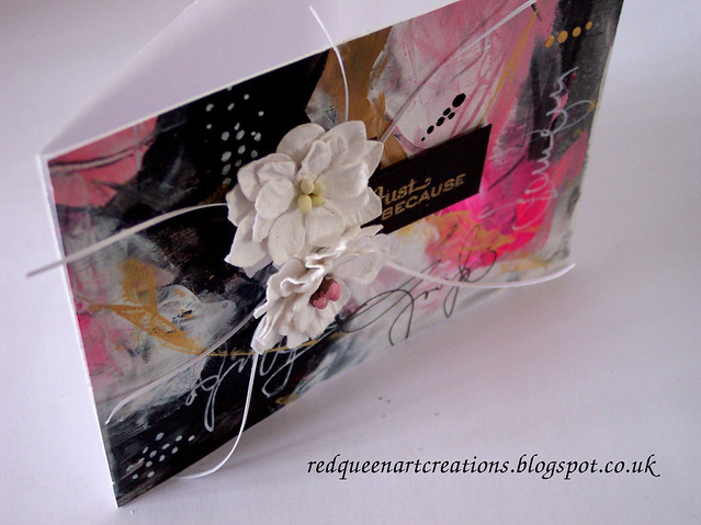
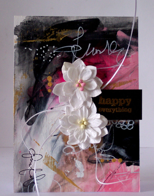
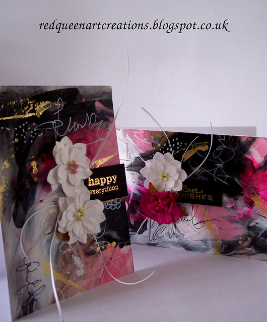
I love making a mess. Paint wise that is. And I certainly did with these cards...
Lots of layers of acrylic paint with doodles and scribble grafitti...
The gold paint is my absolute fave-DecoArt Fluid metallic gold, it is a lovely shade of gold and has an amazing shine.
The other colour which I feel really made these cards is Opera Rose acrylic paint by Windsor and Newton. It looks a scary vivid pink in the tube but is actually a lovely bright pink, and I think goes beautifully with the other shades of pink and grey I've used.
The flowers are by Hobbycraft and sentiment stamps by Paula Pascale.
To finish I added some slivers of white card which I ran between my fingers to make it curl.
I'm really pleased with how these turned out and how photogenic they are! I will be entering these into the Simon Says Wednesday challenge "anything goes".
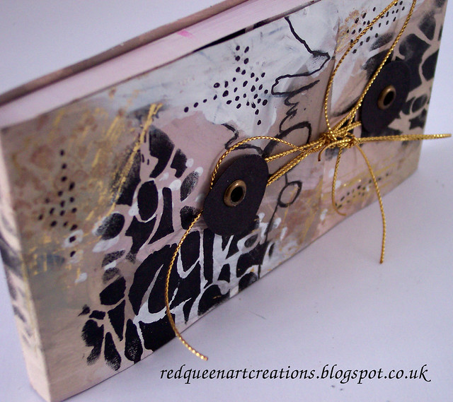
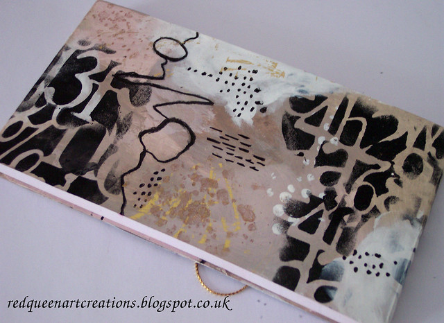
Having made a notebook cover a few weeks ago I just wanted to try another.
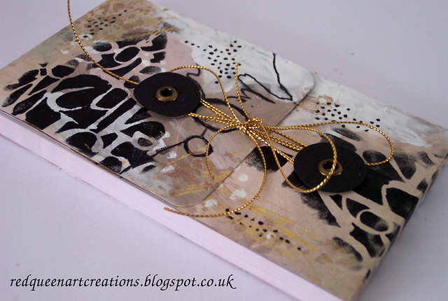
This is a different style, more of a notebook wrap, secured with some washers and eyelets, and finished with some metallic gold cord...
The gold foiling looks quite subtle in the photos but in real life it really catches the light. I added lots of my own doodles but also the Andy Skinner Alphabet Spaghetti stencil in black paint. I loved the result...
And this is the back...
This will be my second entry for this week's Simon Says Wednesday Challenge "Anything goes". I was thrilled to have made the designer spotlight for the Simon Says Monday challenge "grunge it up" and thank you to everyone who has left me such lovely comments, I really appreciate them.
Thankfully our snow is now melting and life is returning to normal. Hope you are all OK,
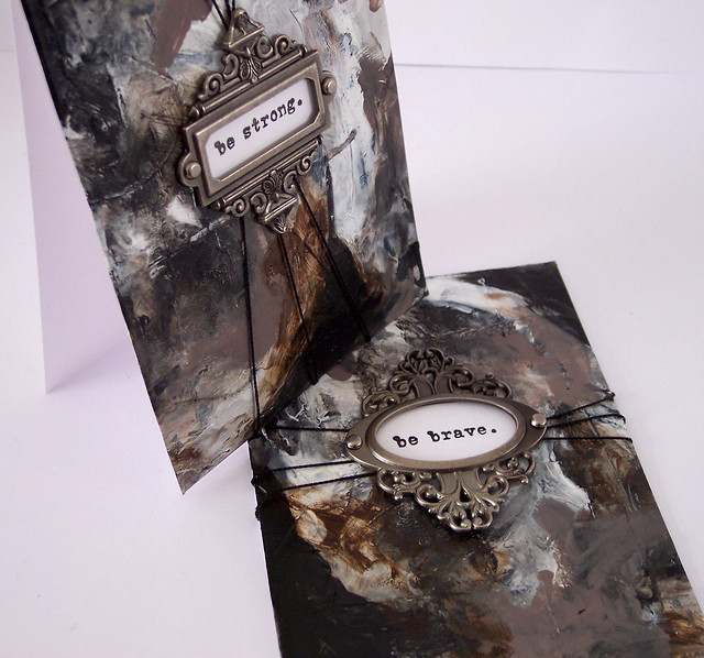
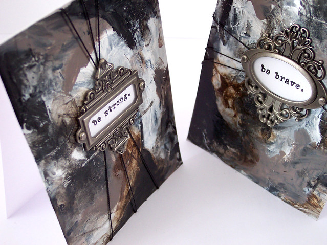
I had never tried heavy body acrylics on cardstock and wasn't sure if it would work.
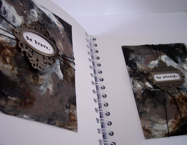
But it did. These creations may not be to everyone's taste, but they have grown on me and I actually love all the texture the paints have created.
In shades of black, burnt umber, mushroom and white I kept layering the paint with my fingers, my preferred way of painting.
There is a rawness to these pieces but I quite like that...
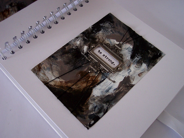
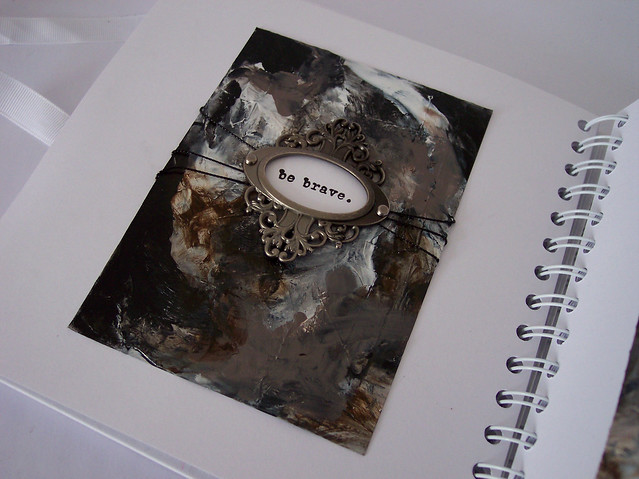
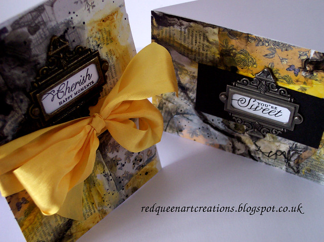
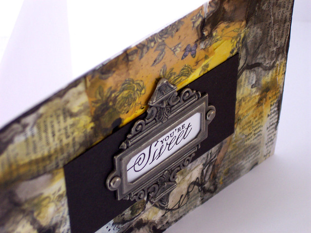
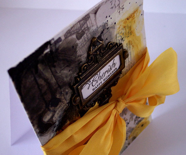
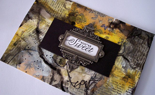
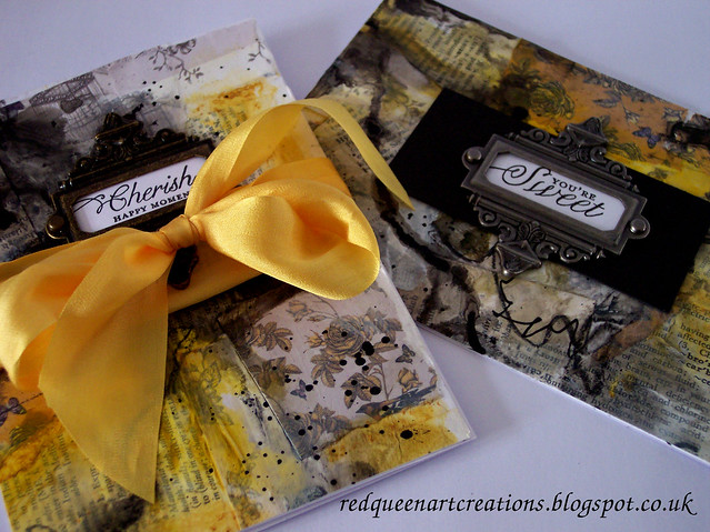
I couldn't make up my mind whether just to put them in my art album or make cards, but I chose to make cards and add the Tim Holtz book plates, I just love them and I think they really suit this grunge style of art.
Like so much abstract work they actually look better from a distance than close up...
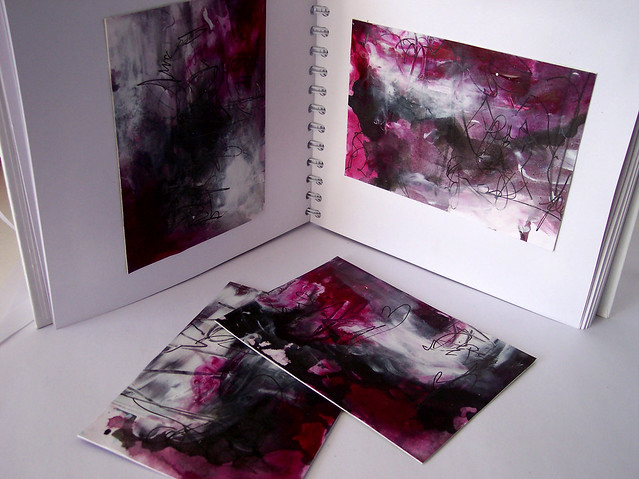
I spent most of yesterday on various art projects but I just did not produce anything that I liked. In fact the more I did, the more it was going horribly wrong.
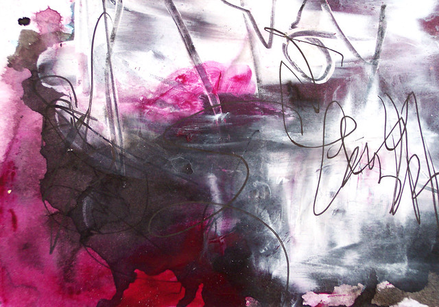
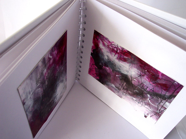
I was about to give up. I had just soaked a piece of card with Liquitex inks in Muted Violet and Carbon Black and it looked awful. But then I added some white acrylic paint and started to scribble and scratch the paint. Suddenly I had the beginning of these pieces of art...
It was the final addition of arcylic paint in Quinacridone Magenta that changed how I felt about these
pieces completely.
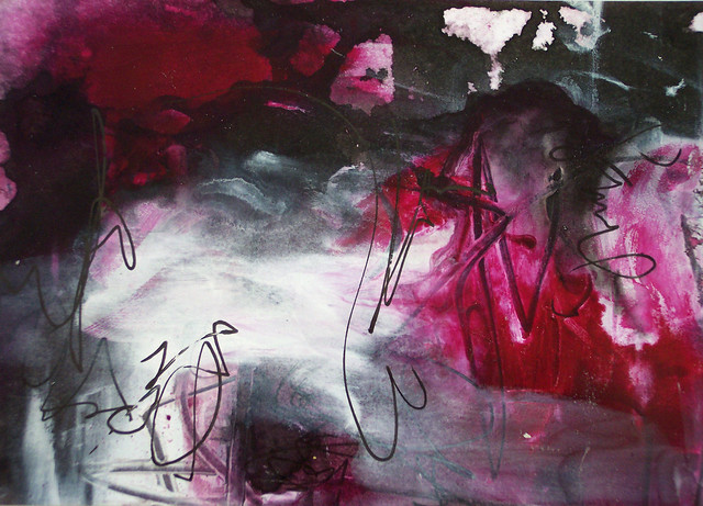
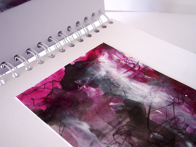
Here a couple of close ups...
Then in was case of what to do with them. I just did not want to cover up any of the art work.
So I have simply displayed them in my art journal.
Now I can look at them and use them as inspiration for future art work maybe.
I may get even more art work done this week as they have forecast snow with potentially blizzards later on in the week which would be quite unusual for this part of the UK. A great excuse to cosy up in my craft room as if I need any excuse!
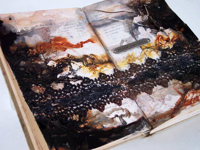
It's been a while since I have done an art journal page and it really made a change from my recent art work.
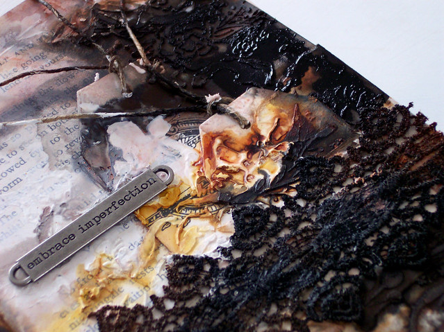
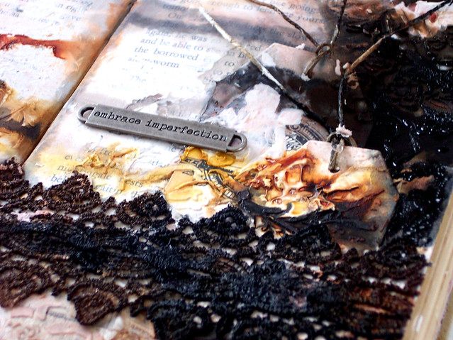
I started by collaging some scraps and adding a couple of tags for interest. I then added lots of heavy gesso for texture...
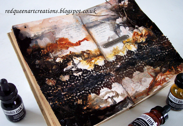
I used Liquitex inks in Burnt Sienna, Raw Umber and Burnt umber. Then I added black. Lots and lots of black. In fact I got a bit carried away...
At first I thought I had ruined my pages but as it dried I really liked it...
The black ink has given the pages I think a very moody, dark look...
Did these pages turn how I expected? No. Did they turn out perfect? No. Hence the title "embrace imperfection".
I will be adding these pages to this week's grunge challenge at Simon Says Monday challenge. I was thrilled to have made the designer spotlight for the "Take Note" last week!
Having lost my mojo a couple of months ago, my mojo is now in full swing so I am making the most of it! These creations are yet another entry for the Simon Says Monday challenge, now my third entry, and for the Simon Says Wednesday challenge which is "make your own background".
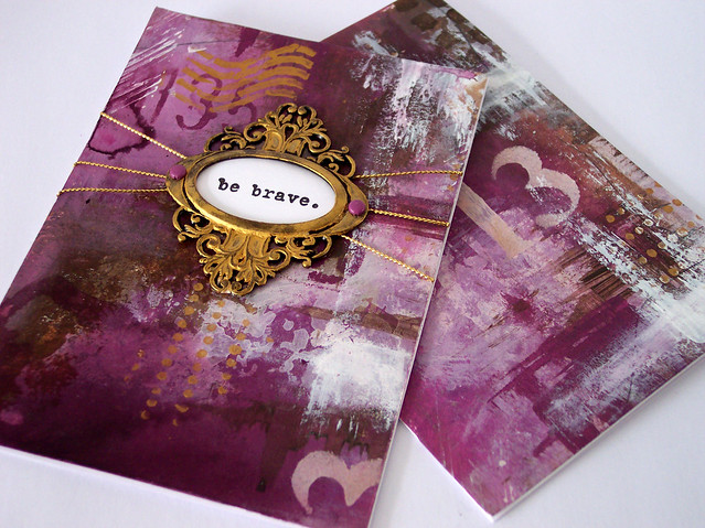
My challenge to myself today was to create a grunge look without using black ink, black paint or my beloved black china pencil.
This was the result...
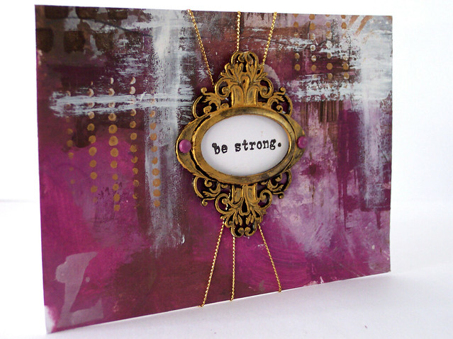
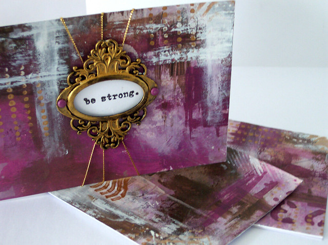
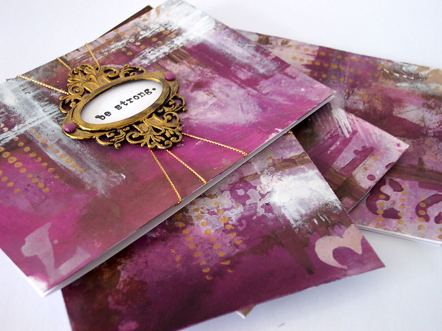
Again, just using a plain piece of A4 300gsm cardstock I started layering acrylic paint in shades of lilac and brown.
I later added some white and then stencilled a few designs in gold.
I also changed the colour of my Tim Holtz ornate book plate by brushing it with gold gilding wax, and added some gold metallic thread.
I have to admit it was hard for me not to pick up some black ink, but I really like it without black.
I am hoping in not the too distant future to start a Youtube channel and upload some process videos to show how I create this artwork, I will let you know when I do.
These creations will be my second entry for this week's Simon Says Monday challenge " Grunge it Up". This time I've gone all out pretty grunge, with floral collage papers and silk ribbon to finish.
I've used Dovecraft's Nature's Grace 6 x 6 papers for my collage to give a lovely floral backdrop to my cards.
I used my Gelatos and Prima oil pastels again to add depth of colour.
After collaging I grunged it to the max with black India ink and my China pencil.
Of course I have used the Tim Holtz ornate book plates to frame my sentiments which are by Stampin Up.
I can't promise I won't do more grunge, I like challenging myself to see how many different grunge looks I can create. Anyway, see you soon xx
If you have read my last few posts you will know how much I love the grunge look, so I was thrilled when I found out that this week's challenge over at Simon Says Monday challenge is called "Grunge it Up". How could I resist?
However rather than use dark colours as I have over the last few weeks I chose much brighter colours, in fact one of my fave colour combinations-shades of lilac and green.
I used Pebeo acrylic paints in Anise Green and Blackcurrent, and Gelatos in Black Cherry and Raspberry. The scribbles were made with a black China pencil and white Sharpie.
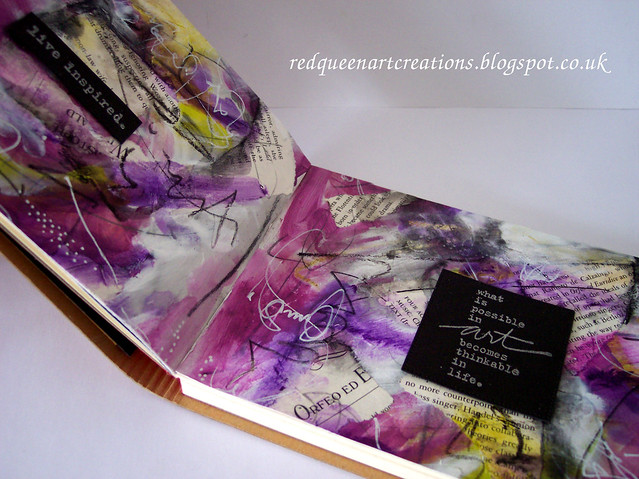
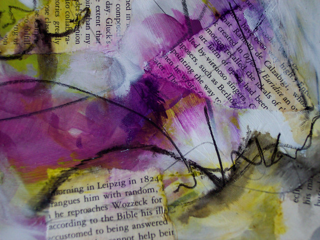
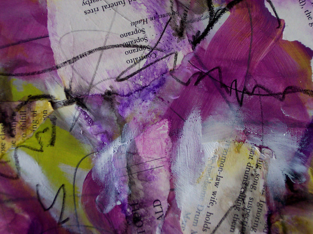
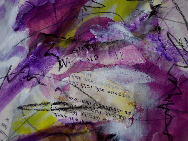
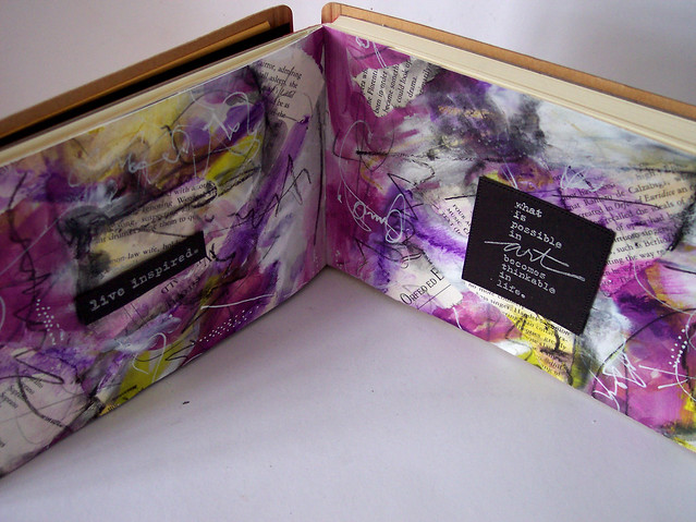
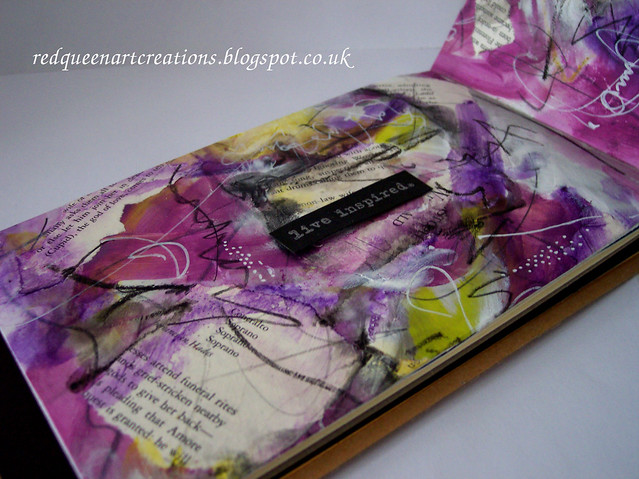
I just used a 300gsm A4 piece of card and used acrylic paint and collaged some book papers. I also used Prima oil pastels and some Gelatos.
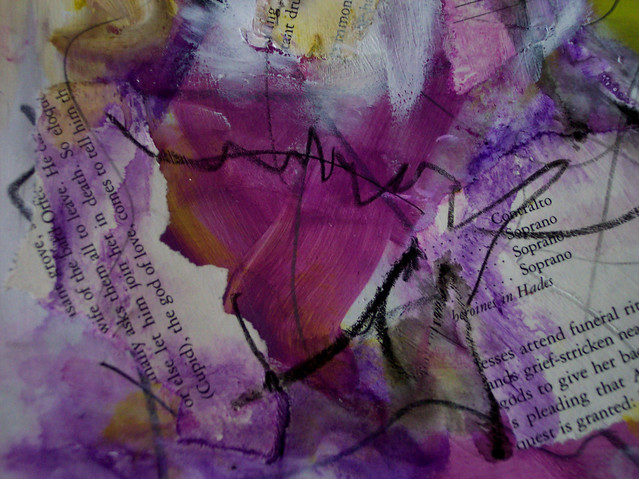
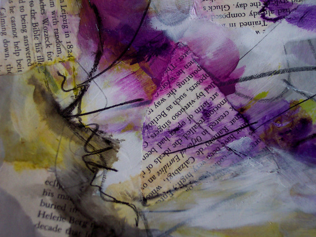
Here are a few close ups of the finished piece...
I was going to make some cards with the finished artwork, but at the last minute decided I liked it too much to cut it up too much and put it in my Dylusions Art Journal instead.
The lovely sentiments are by Donna Downey called Empowered Words, which I've embossed in silver.
Lots of photos today, but I hope you enjoy looking at them as much as I loved creating them. See you soon xx